ShopDreamUp AI ArtDreamUp
Deviation Actions


Suggested Deviants


Suggested Collections
![[ANIMATED] Green Dragon](https://images-wixmp-ed30a86b8c4ca887773594c2.wixmp.com/f/07e0fe07-c785-4399-baa0-bd88bc992dea/de8o01h-4ef6da32-e468-428a-84a5-ef90a5f87716.gif/v1/crop/w_184,h_184,x_0,y_0,scl_0.184/_animated__green_dragon_by_sahel_solitude_de8o01h-92s-2x.png?token=eyJ0eXAiOiJKV1QiLCJhbGciOiJIUzI1NiJ9.eyJzdWIiOiJ1cm46YXBwOjdlMGQxODg5ODIyNjQzNzNhNWYwZDQxNWVhMGQyNmUwIiwiaXNzIjoidXJuOmFwcDo3ZTBkMTg4OTgyMjY0MzczYTVmMGQ0MTVlYTBkMjZlMCIsIm9iaiI6W1t7ImhlaWdodCI6Ijw9MTAwMCIsInBhdGgiOiJcL2ZcLzA3ZTBmZTA3LWM3ODUtNDM5OS1iYWEwLWJkODhiYzk5MmRlYVwvZGU4bzAxaC00ZWY2ZGEzMi1lNDY4LTQyOGEtODRhNS1lZjkwYTVmODc3MTYuZ2lmIiwid2lkdGgiOiI8PTEwMDAifV1dLCJhdWQiOlsidXJuOnNlcnZpY2U6aW1hZ2Uub3BlcmF0aW9ucyJdfQ.g0BZF1JZeLhIiLEVddxwKAQtUnrx6o3FUmEjUFoa2Vg)
![[ANIMATED] Green Dragon](https://images-wixmp-ed30a86b8c4ca887773594c2.wixmp.com/f/07e0fe07-c785-4399-baa0-bd88bc992dea/de8o01h-4ef6da32-e468-428a-84a5-ef90a5f87716.gif/v1/crop/w_92,h_92,x_0,y_0,scl_0.092/_animated__green_dragon_by_sahel_solitude_de8o01h-92s.png?token=eyJ0eXAiOiJKV1QiLCJhbGciOiJIUzI1NiJ9.eyJzdWIiOiJ1cm46YXBwOjdlMGQxODg5ODIyNjQzNzNhNWYwZDQxNWVhMGQyNmUwIiwiaXNzIjoidXJuOmFwcDo3ZTBkMTg4OTgyMjY0MzczYTVmMGQ0MTVlYTBkMjZlMCIsIm9iaiI6W1t7ImhlaWdodCI6Ijw9MTAwMCIsInBhdGgiOiJcL2ZcLzA3ZTBmZTA3LWM3ODUtNDM5OS1iYWEwLWJkODhiYzk5MmRlYVwvZGU4bzAxaC00ZWY2ZGEzMi1lNDY4LTQyOGEtODRhNS1lZjkwYTVmODc3MTYuZ2lmIiwid2lkdGgiOiI8PTEwMDAifV1dLCJhdWQiOlsidXJuOnNlcnZpY2U6aW1hZ2Uub3BlcmF0aW9ucyJdfQ.g0BZF1JZeLhIiLEVddxwKAQtUnrx6o3FUmEjUFoa2Vg)


You Might Like…


Featured in Groups


Description
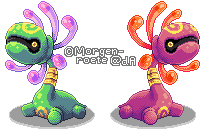
Wanted to go on with some drawings today, but it seems it's one of those days I can't draw anything to save my life. ") So have some pixel art instead!
So have some pixel art instead!
Cradily. In gen 3 I always thought it looked kinda dumb with those "teeth" until I saw it in Colosseum and noticed these things are it's eyes. I found it interesting since then and wanted to train one since gen 4, but I never did until a few days ago. And I have never been more impressed by any other Pokémon before!
Not too fond of the outcome, but meh. Might go over it again if I feel like it, so feel free to leave critique. (Smile)")
SAI + mouse
Cradily (c) Game Freak
Art (c) me
Cradily. In gen 3 I always thought it looked kinda dumb with those "teeth" until I saw it in Colosseum and noticed these things are it's eyes. I found it interesting since then and wanted to train one since gen 4, but I never did until a few days ago. And I have never been more impressed by any other Pokémon before!
Not too fond of the outcome, but meh. Might go over it again if I feel like it, so feel free to leave critique.
SAI + mouse
Cradily (c) Game Freak
Art (c) me
Image size
216x132px 9.94 KB
© 2014 - 2024 Tinuvion
Comments15
Join the community to add your comment. Already a deviant? Log In
Wow, I love the vivid colors! I never really thought of Cradily as being shiny (texture-wise haha) nor having a metallic neck, but I do like your interpretation. And your palettes are fantastic. The tiny highlights and careful use of shadows for contouring are honestly a delight to let my eyes wander over. Very good use of dithering, too. Great job! 
As for critique, with the shiny version, I feel like the colors of the "petal's" shadows are too similar. The color difference between the tip and rest of the petal/tentacle/tendril/????/whatever is only clear on the top three; the bottom three look mostly the same coral color. Also, the one with the most foreshortening just looks a little off. Perhaps it would look better if the foremost part of it was angled down a bit more? Alternatively, you could try making that part a bit shorter and wider. Just a couple pixels wider would do quite well, methinks.
Looking at the other comments; I'm surprised at how many other people didn't realize those were the eyes! xD It was pretty obvious to me, haha.